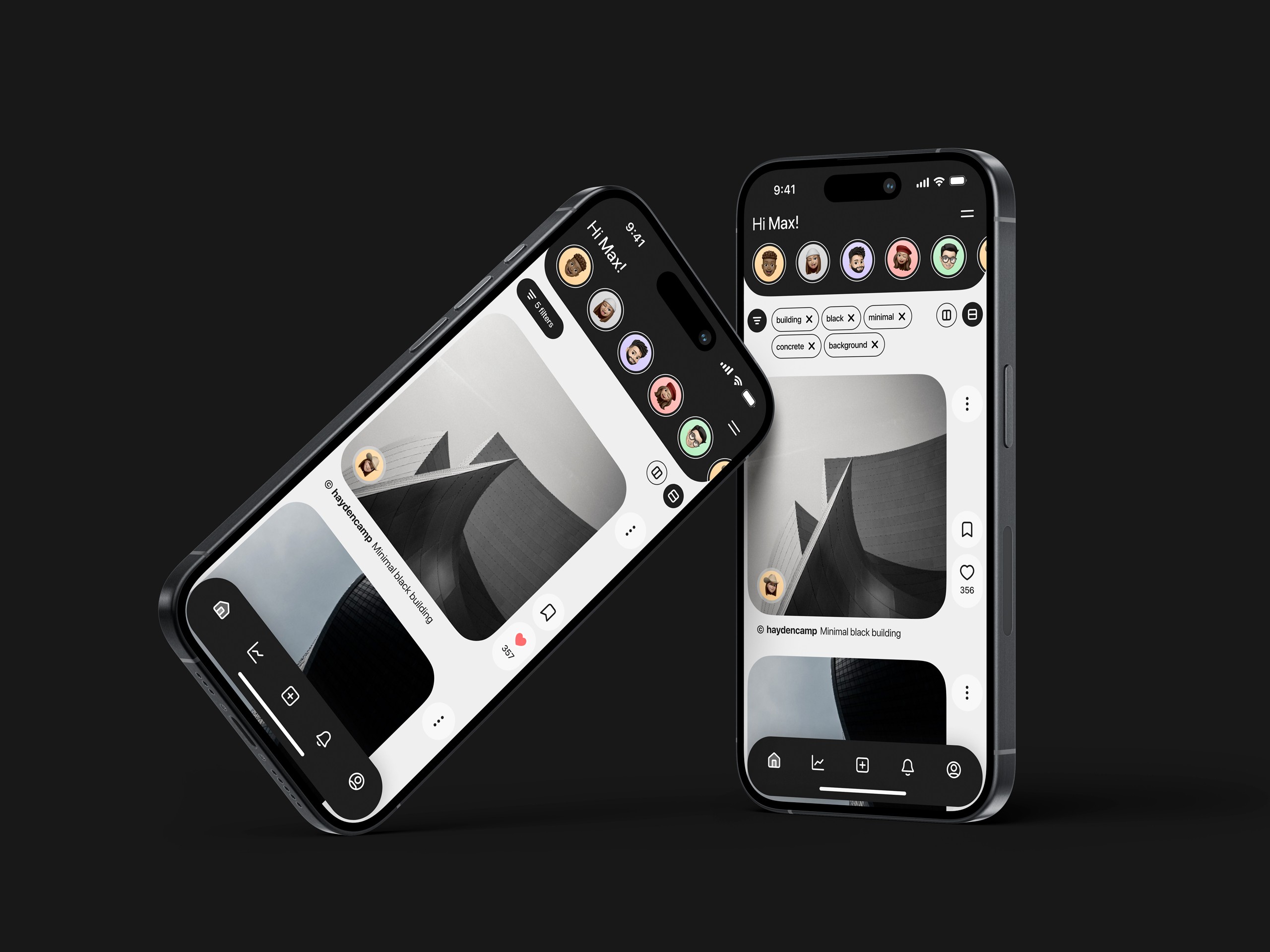
Structure & Silence
A curated social platform dedicated exclusively to architecture, free from the noise.

The research
During the discovery phase, I identified a key pain point: architects and students feel frustrated on generalist platforms like Instagram. The algorithms prioritize viral trends over technical quality, and comment sections often devolve into toxicity, distracting from the work itself.
Architecture demands contemplation, yet current social media platforms are designed for rapid reactions and ephemeral consumption.
The insight
The user isn't seeking to 'socialize' in the traditional sense; they are seeking inspiration, technical references, and a respectful space to showcase their portfolio.
The goal
Less Ego, More Craft.
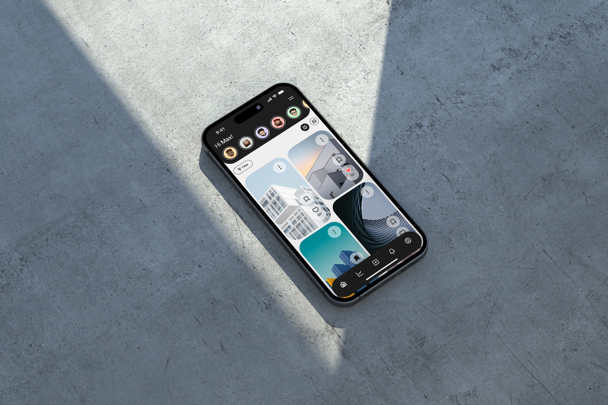
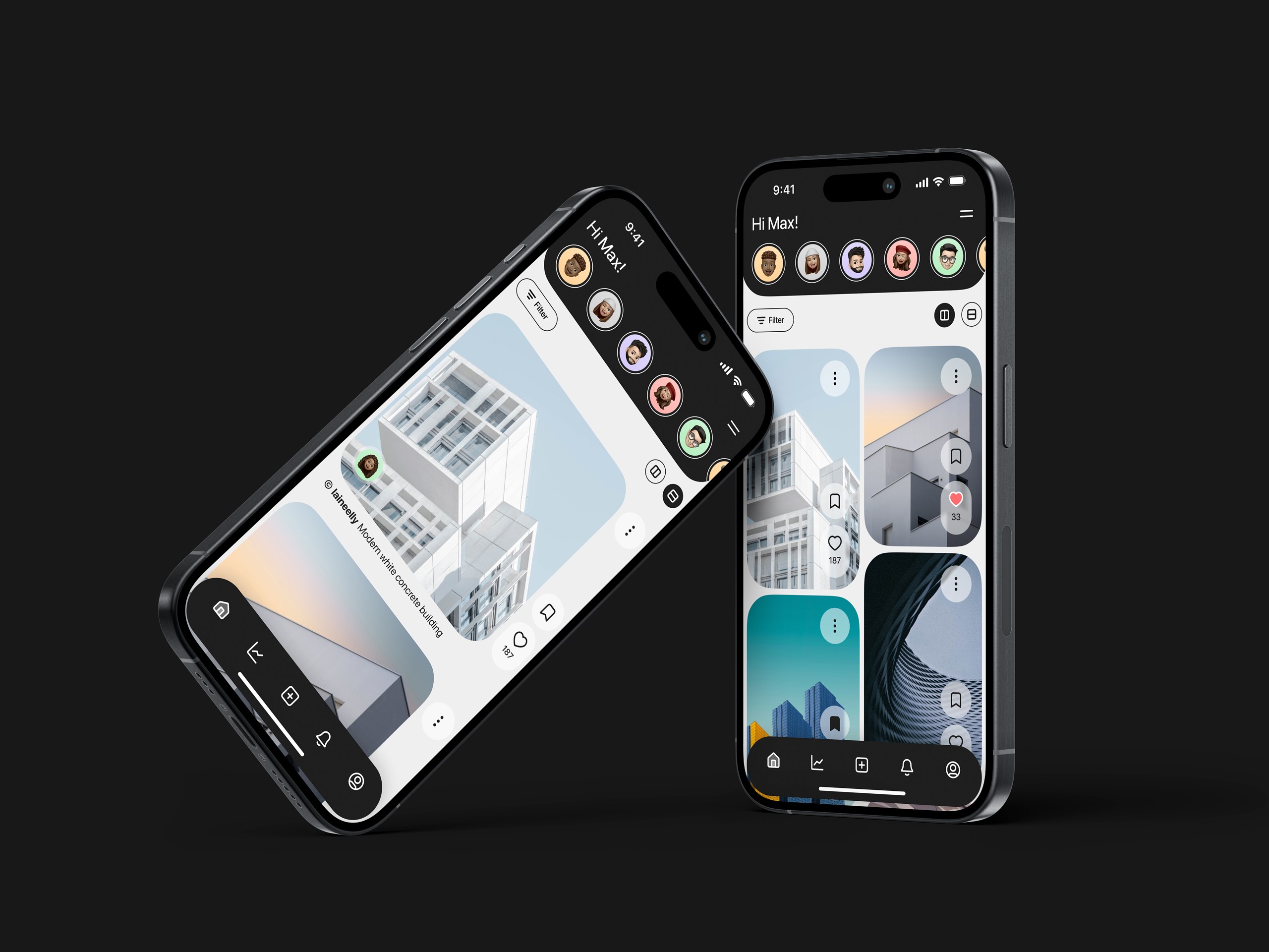
The goal was to create a minimalist digital ecosystem where the interface dissolves, allowing structure, light, and materials to take center stage. A curated network where validation comes from professional respect, not media noise.
The design solution
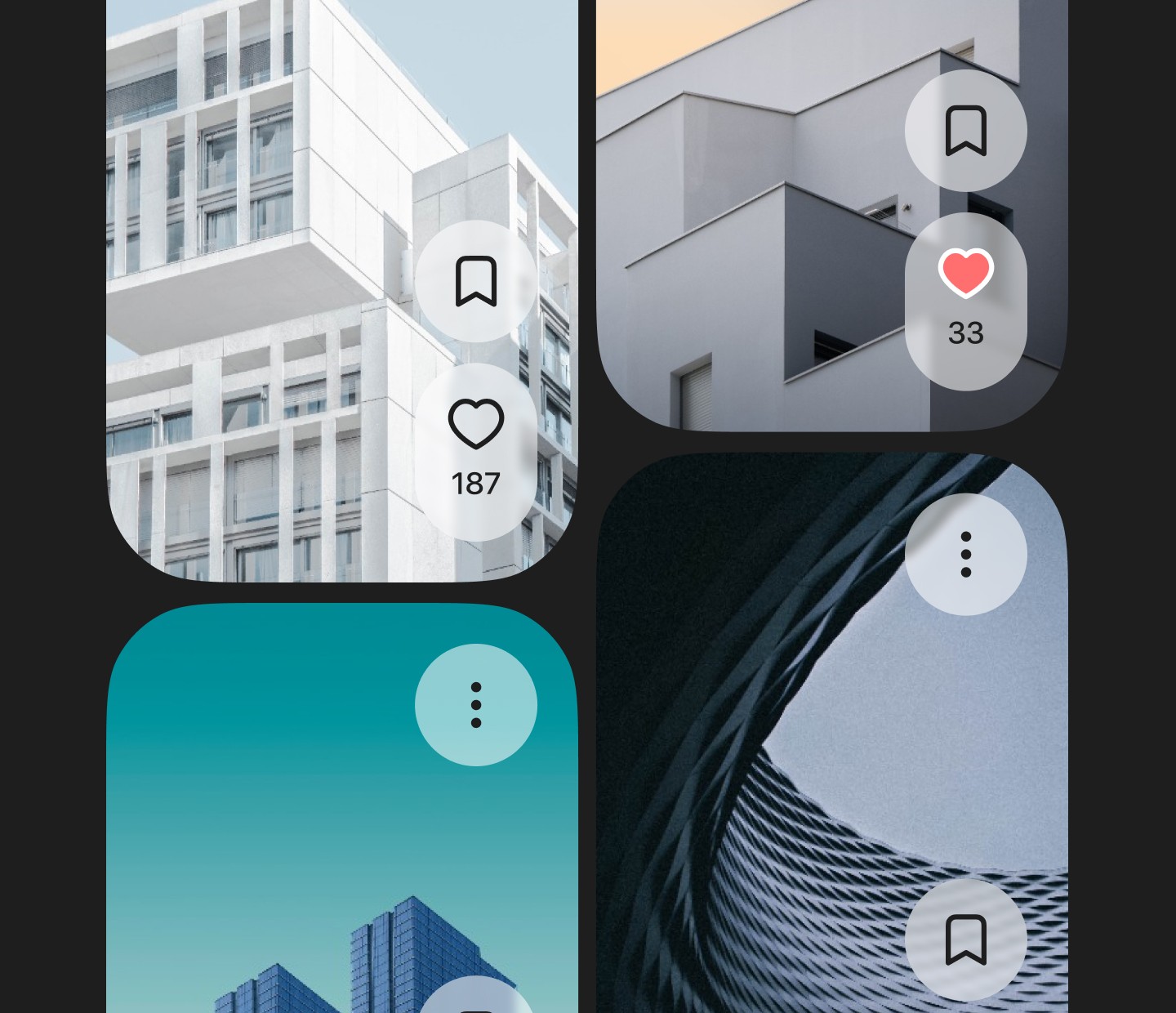
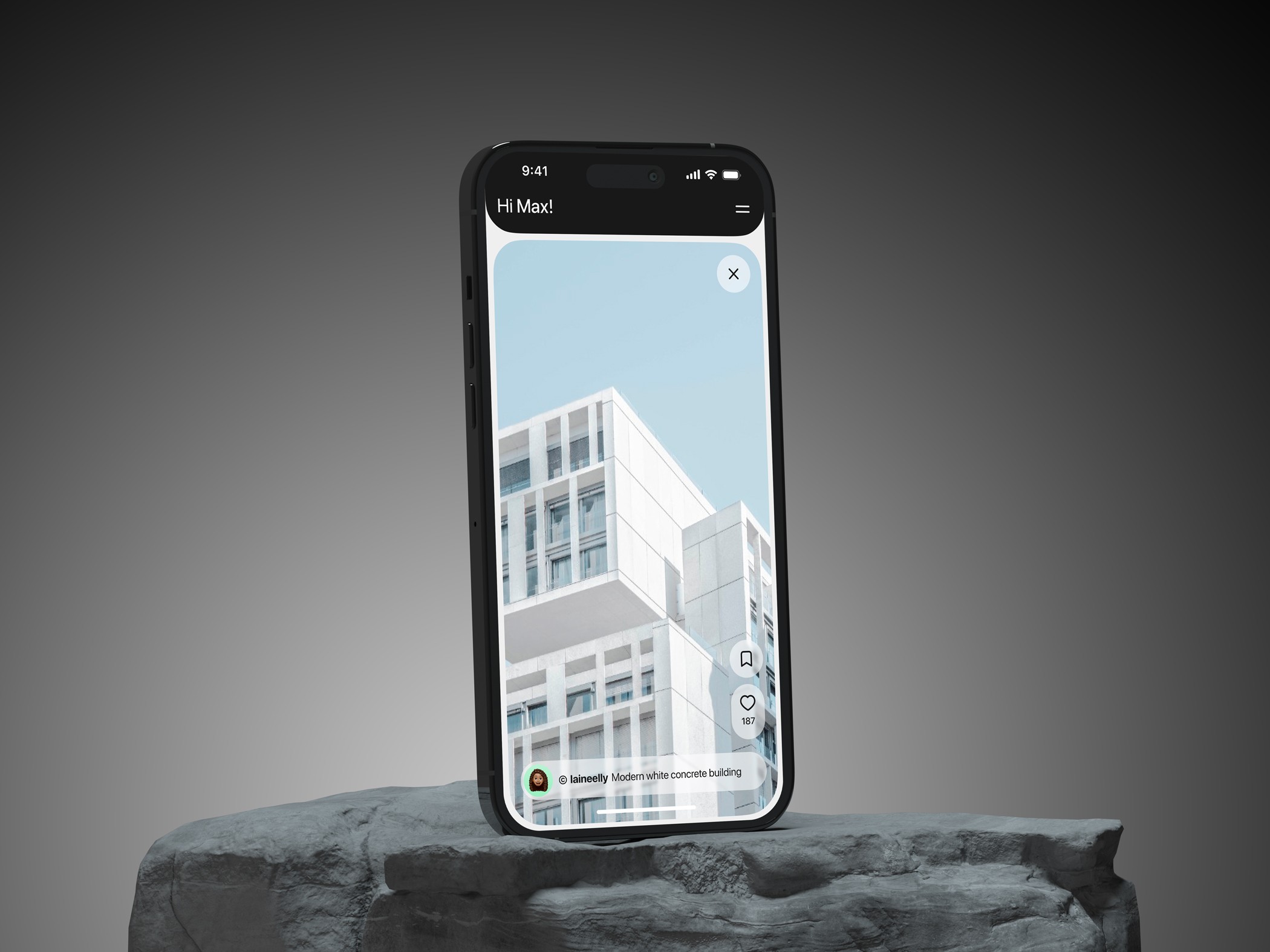
Radical Minimalism: A neutral monochromatic palette and clean sans-serif typography act as a blank canvas, ensuring the architectural photography provides the only color and texture.
Intuitive Navigation: A floating bottom navigation bar and soft rounded corners improve ergonomics and visually soften the experience, contrasting with the rigid lines of the architecture.
Frictionless Interaction: Intrusive vanity metrics were removed. The 'save' and 'like' systems are subtle, encouraging users to build personal reference libraries rather than competing for attention.
Dynamic Grid: A visual feed designed to respect architectural photography formats (verticals and panoramics) without forced cropping.